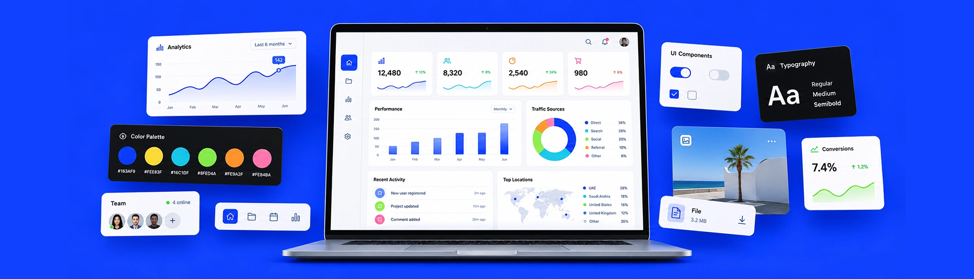
What Are Graphic Elements in Web Design?
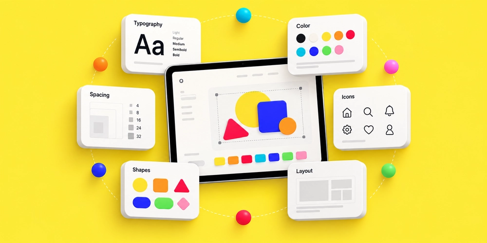
Graphic elements in web design are visual components used to organize information, direct attention, communicate meaning, and establish a brand’s visual identity. Common examples include typography, images, shapes, icons, color, spacing, cards, lines, textures, animations, and interactive graphics.
These elements differ from the basic technical components of a website, but they work closely with navigation, content, buttons, forms, and other interface features.
A useful graphic element should answer a simple question.
What does this help the visitor see, know, or do?
If the answer is unclear, the element may be adding decoration rather than value.
What Makes a Graphic Element Effective in Web Design?
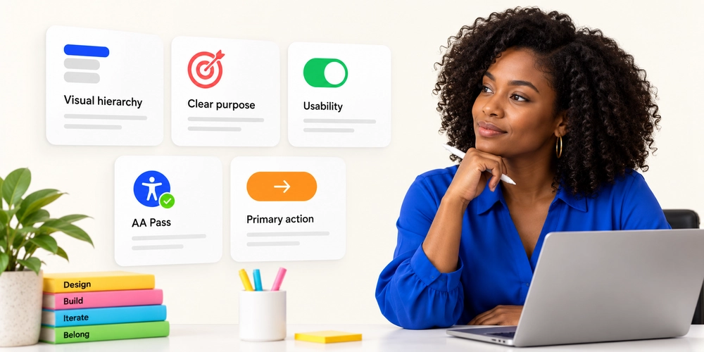
Visual design works best when each decision supports a specific user need.
A homepage hero, for example, has limited space to establish a message. The heading establishes priority. Photography creates context. Spacing separates the message from secondary information. A contrasting button indicates the next action.
Every element contributes to the same goal.
It Has a Clear Purpose
Effective website elements generally perform one or more of these functions:
- Establish visual hierarchy
- Separate related information
- Direct attention
- Communicate status or meaning
- Support navigation
- Reinforce brand identity
- Highlight an important action
An element does not need to attract attention to be useful. White space can be as important as a photograph. A thin divider may organize a page more effectively than another graphic.
It Works for the User
A design can look polished and still create friction.
Small icons without labels may confuse visitors. Text over a photograph may become hard to read. Hover-based information may disappear for touchscreen users. A creative menu can force people to search for basic navigation.
Effective web design reduces effort rather than adding another visual task.
UI and UX Work Together
User interface design shapes how controls, graphics, text, and other web page elements appear.
User experience focuses on whether people can use those elements efficiently.
The distinction matters. A button may have beautiful typography, spacing, and animation. If visitors cannot identify it as clickable, the design has failed at its primary task.
15 Graphic Elements That Can Improve Your Website Design
You do not need all 15 elements on every landing page. In fact, trying to use everything at once often produces visual noise.
Choose the website design elements that support your content, brand, users, and conversion goals.
Typography That Creates Visual Hierarchy
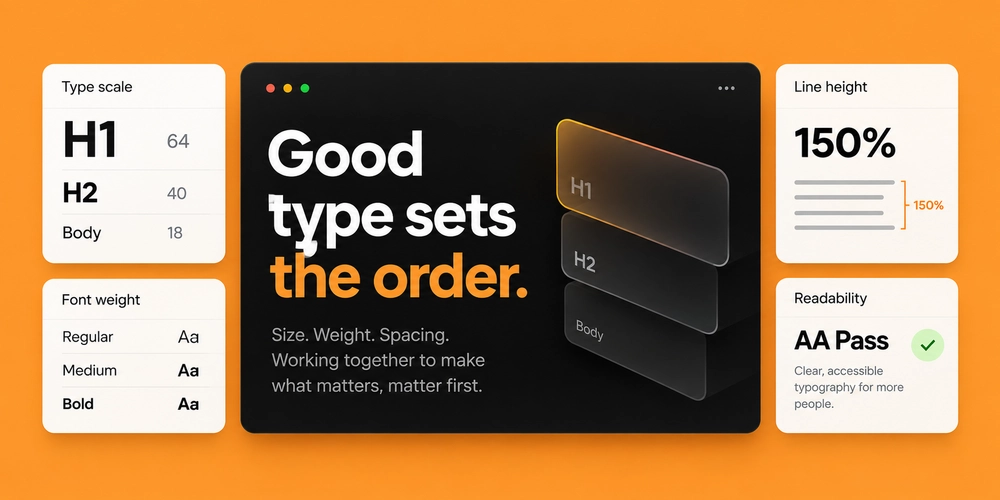
Typography does much more than display words.
Font size, weight, spacing, contrast, and placement tell readers what matters first. A strong headline can become the main graphic feature of a hero section without relying on elaborate imagery.
A practical type hierarchy might include a large page heading, smaller section headings, readable body copy, and clearly styled labels.
Problems begin when every line competes for attention.
Five font weights, oversized body text, several display fonts, and inconsistent spacing can make a simple page harder to scan.
Good typography creates clear levels of importance.
For most sites, one primary type family and a carefully selected supporting font are enough. Responsive scaling also matters. A dramatic 90-pixel desktop heading needs a sensible mobile size rather than simply shrinking with the viewport.
Font files have a performance cost too. Loading many families, styles, and weights can add unnecessary page weight.
White Space and Intentional Spacing
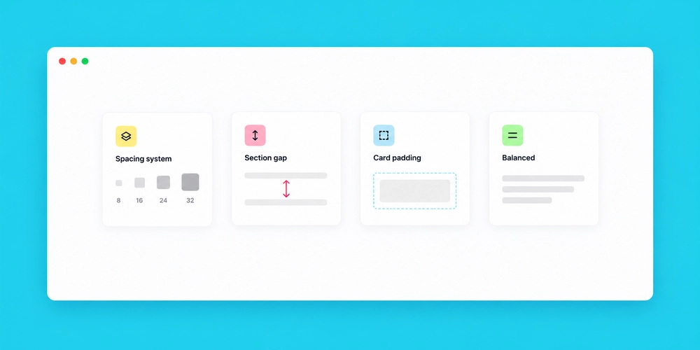
White space is the empty area around text, images, buttons, cards, and sections. It does not have to be white.
A dark website can use white space. So can a colorful interface.
Spacing helps users identify which items belong together. It gives headings room to lead a section. It prevents buttons from competing with nearby copies.
This is one of the simplest ways to improve a crowded website layout.
A common mistake is filling every available area because empty space seems unfinished. The result often feels busier, not more complete.
Space is part of the design. It gives the other elements room to communicate.
Use consistent spacing intervals instead of choosing random gaps for each section. That creates rhythm across the page and makes repeated components feel connected.
Lines, Borders, and Dividers
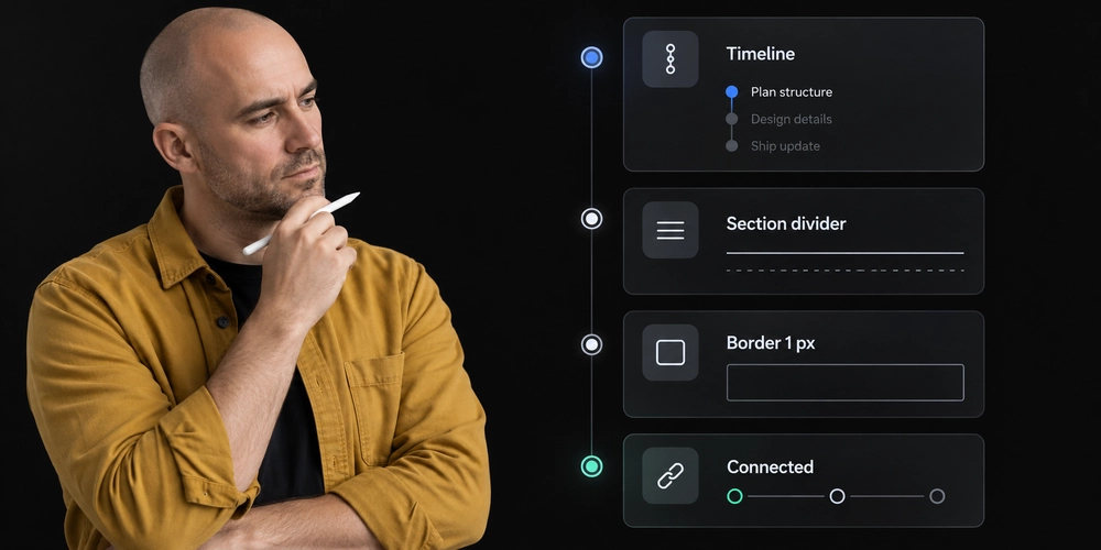
White space is the empty area around text, images, buttons, cards, and sections. It does not have to be white.
A dark website can use white space. So can a colorful interface.
Spacing helps users identify which items belong together. It gives headings room to lead a section. It prevents buttons from competing with nearby copies.
This is one of the simplest ways to improve a crowded website layout.
A common mistake is filling every available area because empty space seems unfinished. The result often feels busier, not more complete.
Space is part of the design. It gives the other elements room to communicate.
Use consistent spacing intervals instead of choosing random gaps for each section. That creates rhythm across the page and makes repeated components feel connected.
Geometric and Organic Shapes
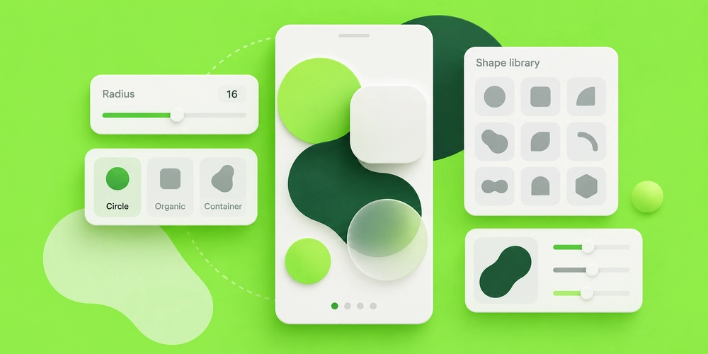
Squares, circles, rectangles, rounded containers, polygons, and free-form shapes can establish a visual language without requiring large illustrations.
Geometric shapes often feel structured and precise. Organic shapes can make a layout feel softer and less mechanical.
These elements can work behind text, frame photographs, identify categories, or connect separate sections.
The strongest approach is repetition.
If rounded corners appear throughout the website design, keep the radius system consistent. If circles become a recognizable brand feature, repeat them with purpose rather than introducing unrelated shapes later.
A small visual vocabulary usually creates a stronger identity than a large collection of unrelated effects.
Color Blocks and Contrast
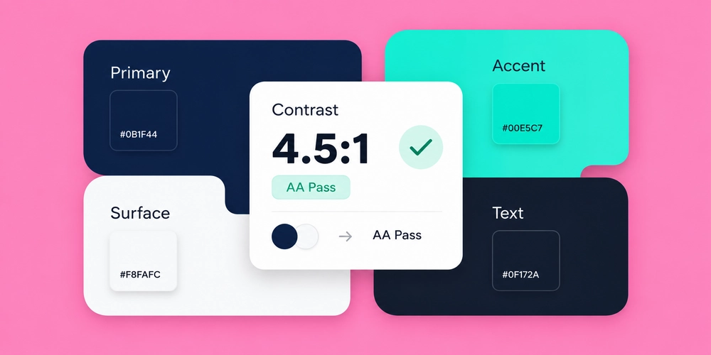
Color can separate sections before a visitor reads a single word.
A contrasting background may identify a featured service. A darker block can mark an important CTA. A brand accent can show which actions are interactive.
The mistake is assuming more color creates more visual interest.
When every section changes hue, the visitor must repeatedly adjust to a new visual environment. Strong colors also compete with buttons, alerts, and other elements that genuinely need attention.
Contrast needs careful testing.
WCAG 2.2 sets a minimum contrast ratio of 4.5:1 for normal text and 3:1 for qualifying large text at Level AA.
Use color to establish meaning and priority, not simply to fill space.
Photography and Hero Imagery
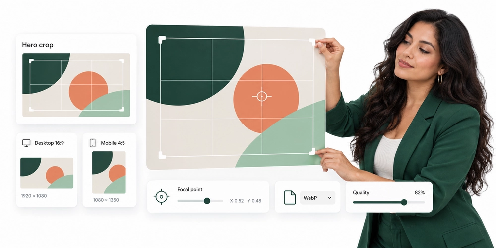
Photography can establish context within seconds.
A hotel may show the actual property. A restaurant can show its food. A software company may show customers using the product. A professional service business can introduce the people behind the company.
Original photography often feels more specific because it represents the real business rather than a generic category.
Composition matters as much as image quality.
If text sits beside the subject, choose a crop that leaves usable negative space. If text appears over the image, test readability at different breakpoints.
Large hero imagery also requires technical care. Resize images to the dimensions users actually need, use suitable modern formats where appropriate, and avoid loading oversized desktop files on smaller screens.
Custom Illustrations
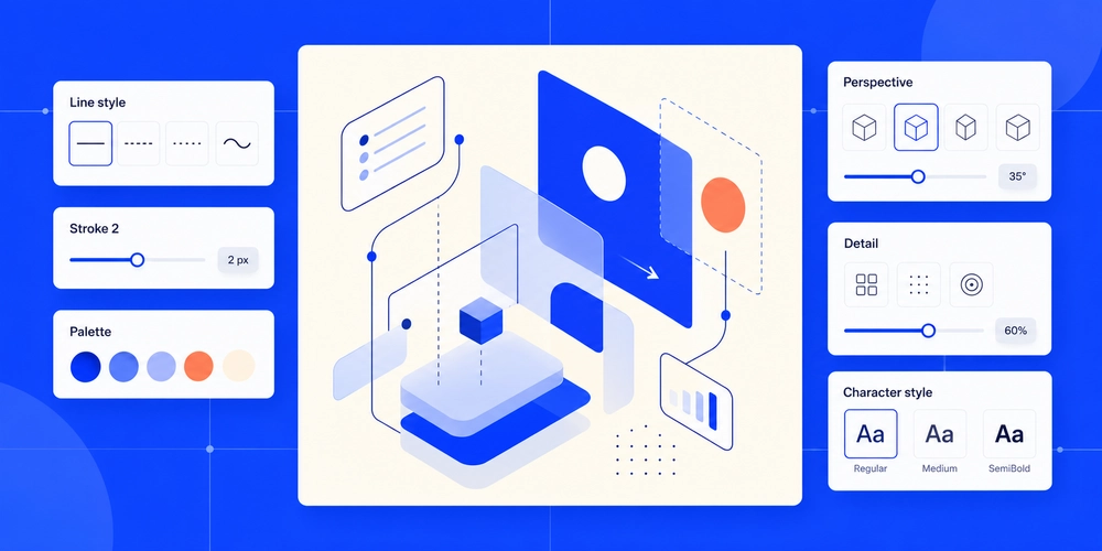
Illustration works especially well when photography cannot easily communicate an idea.
A cybersecurity company might illustrate how information passes between systems. A financial platform can visualize a workflow. A service business may use illustrations to simplify an abstract process.
Custom illustration can also help a brand look distinct in categories filled with similar stock photography.
Style consistency is critical.
Mixing flat illustrations, detailed 3D artwork, hand-drawn icons, and stock vectors on one page can make the visual identity feel fragmented.
Choose one illustration language and define its:
- Line treatment
- Shape style
- Perspective
- Level of detail
- Color range
- Character style, if people are shown
This turns individual graphics into a recognizable system.
Icons and Visual Symbols
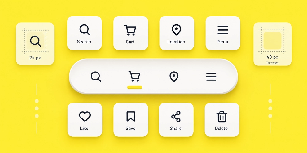
Icons reduce the amount of space needed to communicate familiar actions.
A magnifying glass can indicate search. A shopping bag can identify a cart. A location pin can introduce address information.
Problems appear when designers assume every symbol is universal.
A custom icon may look elegant but mean nothing to a first-time visitor. In those cases, pair the icon with a short text label.
Interactive icons also need enough room to tap. WCAG 2.2 includes a Level AA target-size criterion of at least 24 by 24 CSS pixels, subject to listed exceptions and spacing rules.
An icon should reduce effort, not make people decode the interface.
Cards and Modular Content Blocks
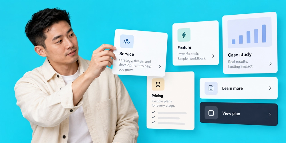
Cards are among the most flexible components of website design.
They can organize services, products, articles, team members, case studies, features, testimonials, and pricing options.
A good card establishes hierarchy quickly.
The title identifies the subject. Supporting text adds context. An image or icon helps recognition. A link or button shows whether an action is available.
Consistency makes card systems easier to scan.
If five service cards perform the same function, they should generally share the same structure. Large differences in image ratio, text length, button placement, or spacing make the grid harder to read.
Cards become less useful when every piece of content is boxed. Some sections benefit from open layouts without containers.
Bento and Asymmetric Grids
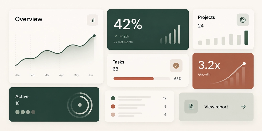
Bento-style layouts use blocks of different sizes to organize several pieces of information within one visual system.
A large card might highlight the primary product benefit. Smaller cards can show supporting features, metrics, imagery, or screenshots.
The technique works because size communicates priority.
Without that hierarchy, the result becomes a random collection of rectangles.
A strong bento layout should answer three questions:
- Which block deserves attention first?
- Which items belong together?
- What happens when the layout collapses on mobile?
Desktop asymmetry often needs a simpler mobile sequence. Content should reorder according to meaning, not according to whichever card happened to appear first in the desktop grid.
Directional Cues, Arrows, and Visual Paths
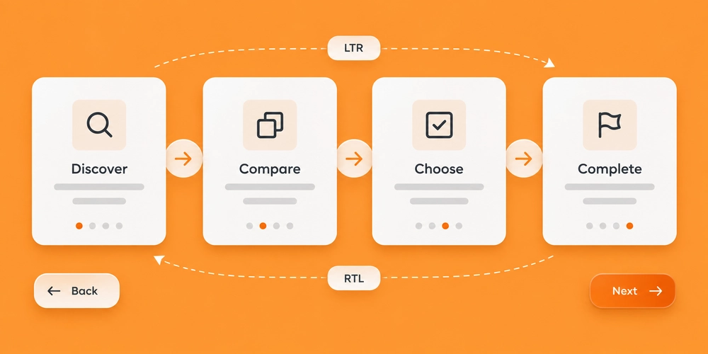
Directional graphics guide attention.
An arrow may point from an explanation to a CTA. A line can connect stages of a process. Numbered markers can help users follow a sequence.
These cues are most useful when the intended direction is not immediately obvious.
Avoid placing arrows everywhere. Their effect weakens quickly if every section points somewhere.
Directional elements also require extra thought on multilingual sites. An arrow that makes sense within a left-to-right English layout may need a different treatment in an Arabic right-to-left interface.
Direction should match reading flow and interaction flow.
Texture, Grain, and Layered Backgrounds
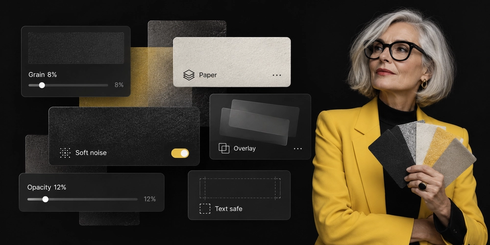
Flat digital surfaces can sometimes feel too clean or interchangeable. A subtle grain, paper texture, soft pattern, or layered background can add visual character without dominating the page. Texture works best at low intensity. Heavy patterns behind paragraphs can reduce readability. Large image textures can also create extra page weight without adding much value. Keep important text on areas with predictable contrast. A background should support the content in front of it. If users notice the texture before the message, the effect may be too strong.
Micro-Interactions and Motion
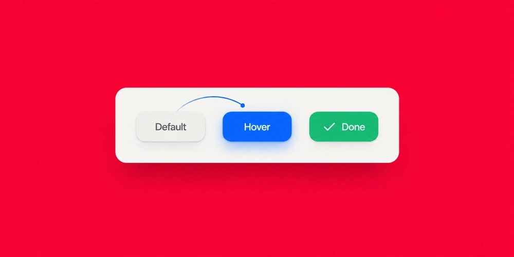
Motion is useful when it communicates a change. A button can react when pressed. A tab can show selection. A loading indicator can confirm that an action is processing. A menu can reveal its open state. These are functional micro-interactions. Decorative movement is different. Constant floating elements, aggressive parallax, animated cursors, and repeated entrance effects can pull attention away from the content. Some users are also sensitive to motion. W3C guidance recommends giving users a way to prevent non-essential interaction-triggered animation and recognizes reduced-motion preferences as a useful technique.
The best motion explains what happened after an action.
If an animation does not provide feedback, hierarchy, continuity, or useful emphasis, consider removing it.
3D and Layered Visual Elements
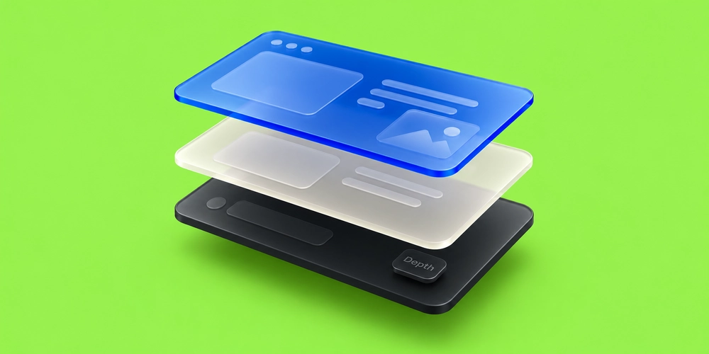
3D works best when depth communicates something useful.
A furniture company can let users inspect a product from multiple angles. A manufacturer may show an internal component. A technology company can illustrate relationships between connected systems.
The graphic becomes part of the explanation.
Decorative 3D requires more restraint. Interactive scenes can require large assets, additional scripts, and more rendering work on the user’s device.
Use a static visual or lightweight animation when the same idea can be communicated with less technical cost.
Visual sophistication should never come at the expense of access to the content.
Navigation Graphics and Hamburger Menus
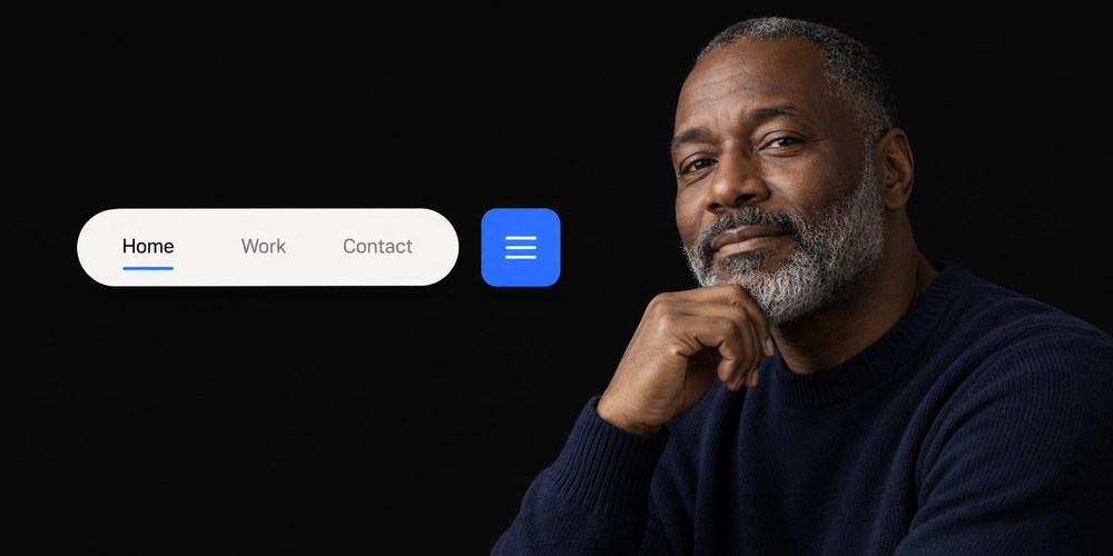
Navigation contains several visual elements, including icons, dropdown indicators, tabs, breadcrumbs, menu buttons, and active states.
The hamburger menu is one of the most familiar mobile examples. It saves space by hiding navigation behind an icon.
That does not mean it belongs everywhere.
Desktop websites with four primary links may benefit from showing those links directly. Hiding obvious options adds another interaction.
Navigation graphics need clear states too. Visitors should be able to tell which page is active, whether a submenu is open, and which elements are clickable.
Navigation should feel predictable even when the wider visual design is highly creative.
How to Combine Web Design Elements Without Creating
Clutter
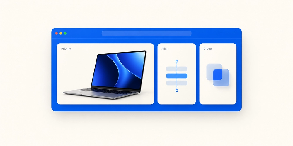
A website becomes visually noisy when too many elements ask for attention at the same level. The solution is not removing personality. It is establishing priority.
Start With One Visual Priority
Each section should have a clear focal point.
That may be:
- A heading
- A photograph
- A product screenshot
- A statistic
- A CTA
- A diagram
Supporting elements should reinforce that focal point.
Build a Consistent Website Layout
Use recurring rules for spacing, grid widths, image ratios, type sizes, borders, and cards. Visitors should not need to learn a new visual system every time they scroll. Consistency also helps development teams turn designs into reusable components rather than one-off layouts.
Repeat a Small Visual Vocabulary
A cohesive site might use one icon style, one card system, one illustration language, one corner-radius family, and one motion approach. That is often enough. Adding another effect to every section makes the page feel less intentional.
Use Contrast Selectively
If every headline is enormous, none feels important.
If every card has a bright background, the real CTA becomes harder to spot.
Contrast works because something else is quieter.
Graphic Elements That Can Hurt Website Usability
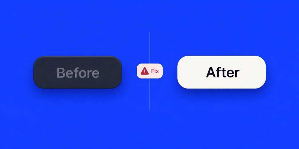
Creative visual choices need limits. Some effects work well for campaigns, portfolios, and editorial sites but become frustrating when applied to basic interactions.
| Graphic element | Main risk | Better approach |
| Horizontal scrolling | Users may miss hidden content | Reserve it for clear, intentional sequences |
| Auto-moving marquees | Text becomes harder to read | Keep essential messages static |
| Custom cursors | Clickable states may become unclear | Preserve familiar pointer feedback |
| Constant animation | Distraction and motion sensitivity | Use motion for feedback and state changes |
| Oversized typography | Mobile overflow and broken hierarchy | Use responsive type scales |
| Heavy 3D | Larger technical cost | Load selectively or use lighter alternatives |
| Unfamiliar icons | Meaning is unclear | Add concise labels |
| Low-contrast graphics | Reduced readability | Test foreground and background contrast |
| Hidden desktop navigation | Reduced discoverability | Show key links when space allows |
This does not mean these techniques are automatically bad.
The question is whether the visual benefit justifies the interaction cost.
Design for Mobile Before Adding More Graphics
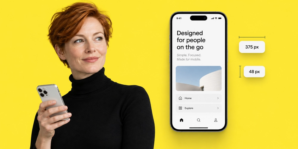
Mobile should influence the design from the beginning, especially for complex web page design elements. A wide composition may need to stack. A photograph may need a different crop. Hover states require touch alternatives. Large types need responsive limits. Dense bento layouts need a meaningful reading order. Buttons and icon controls also need enough space for touch interaction. Do not treat mobile as a smaller desktop version.A strong mobile design keeps the same hierarchy while changing the composition. That may mean removing a decorative graphic, simplifying a background, reducing animation, or replacing a complicated interaction with a straightforward control.
Which graphic elements are most likely to slow down a website?
Large hero media, autoplay video, oversized images, multiple font files, script-heavy animation, and interactive 3D scenes can create significant performance costs. The exact impact depends on implementation. A well-optimized photograph may load faster than a poorly configured decorative animation. Measure the actual page rather than making decisions from format names alone.
Make Website Graphics Accessible
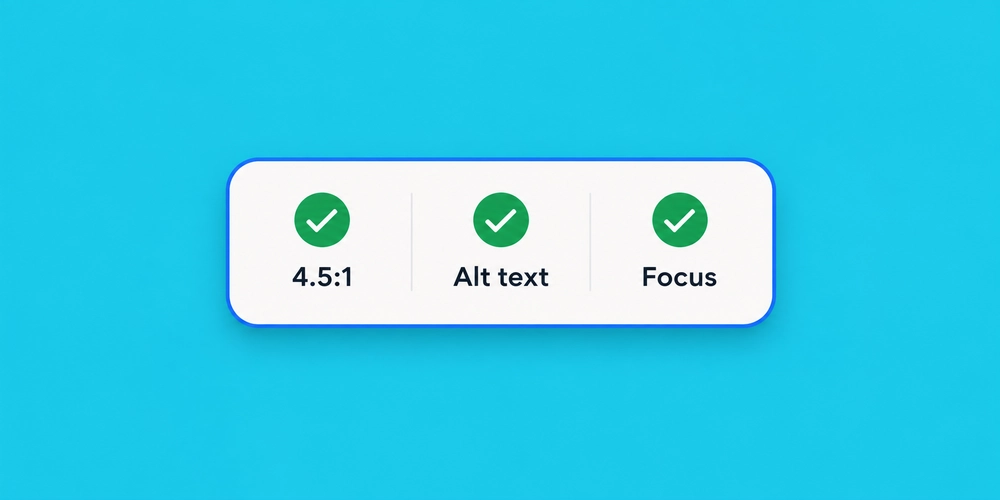
Accessibility should be considered while the visual system is being created, not after every page has been approved.
Start with contrast.
WCAG 2.2 Level AA sets minimum contrast requirements for text and also includes requirements covering keyboard access, visible focus, target size, reflow, non-text content, and other interface behaviors.
For graphics, several practices matter:
- Write useful alt text for informative images
- Leave decorative images with the correct empty alternative treatment
- Avoid placing important information only inside graphics
- Pair unclear icons with labels
- Keep keyboard focus visible
- Respect reduced-motion preferences
- Test text over images at multiple screen sizes
- Ensure interactive graphics can be used without precise pointer movement
Accessibility often improves general usability too. Larger targets are easier to tap. Better contrast helps in bright environments. Clear labels reduce guesswork for everyone.
Test Graphic Elements Befor e and After Launch
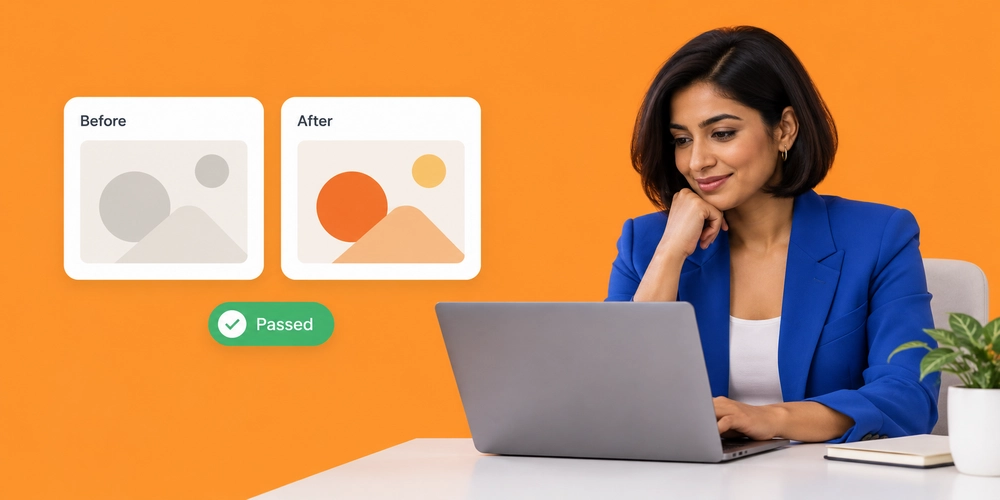
A visual concept may look convincing in a design file and behave differently once real content, devices, and user actions are involved.
Testing closes that gap.
Test Before Development
Prototype important interactions before developers commit to the final implementation.
Check:
- Navigation behavior
- Mobile stacking
- Content hierarchy
- Form flow
- Interactive graphics
- Menu states
- Animation timing
Real content is especially useful. A service card that looks balanced with two lines of placeholder copy may break once the actual title and description are added.
Measure After Launch
Use real behavior to judge whether an important design change helped.
Relevant indicators may include:
- CTA clicks
- Form starts
- Form completions
- Task completion
- Engagement with key content
- Core Web Vitals
- Accessibility errors
- Mobile interaction issues
Avoid declaring success because a redesign feels more modern. A visual change should be evaluated against the job the page needs to perform. Where possible, compare meaningful before-and-after data rather than relying on preference alone.
What Makes a Good Website?
A good website combines useful content, clear navigation, strong visual hierarchy, accessible interaction, responsive design, consistent branding, reliable performance, and obvious next actions. Graphics support those goals. They cannot fix a weak offer, confusing copy, missing information, poor navigation, or a broken form. This is an important distinction because searches for what makes a good website, features of a good website, and what makes a website successful often lead to lists of visual features. Appearance matters, but successful sites solve a communication problem first.
Good website design helps visitors recognize where they are, what the business offers, why it matters, and what they can do next.
How Do You Choose the Right Graphic Elements for a Website?
Do not begin with a list of effects you want to copy.
Start with the page’s purpose.
Ask five questions.
What should the visitor notice first?
Choose one clear focal point for the page or section.
What information needs visual explanation?
Use illustration, diagrams, cards, icons, photography, or 3D only where they make information easier to process.
Which elements fit the brand?
A professional services company, fashion label, children’s product, architecture studio, and industrial supplier should not automatically share the same visual language.
Will the element work on mobile and with assistive technology?
Check reading order, touch behavior, keyboard use, motion, contrast, and alternative text.
Does the visual benefit justify its technical cost?
A complex effect should earn its place.
If a lighter treatment communicates the same idea just as well, the simpler option may serve users better.
Web Design Elements for Dubai and UAE Websites
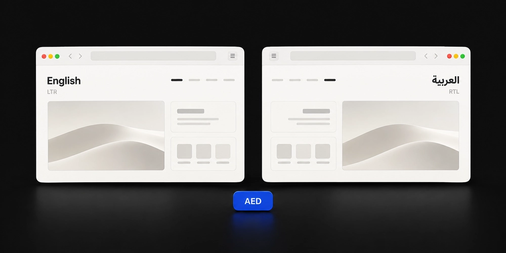
Dubai and UAE websites often serve a multilingual, highly connected audience.
DataReportal’s Digital 2026 UAE report estimates 11.3 million internet users in the country and 23.0 million active cellular connections using late-2025 data. Internet penetration was reported at 99 percent.
That makes mobile behavior difficult to treat as a secondary concern.
There is another important regional requirement.
Arabic changes the visual flow of an interface.
A bilingual website may need to support both left-to-right English and right-to-left Arabic layouts. Navigation order, directional arrows, icon placement, timelines, sliders, cards, and text alignment may all need to respond to the active language.
The UAE Design System states that UAE government websites and applications should support both Arabic and English interfaces, and its current guidance references WCAG 2.2 Level AA for accessibility implementation.
Arabic typography deserves separate testing too. Font proportions, line spacing, heading sizes, and mixed Arabic-Latin content can behave differently from an English-only composition.
A bilingual UAE website should adapt its visual flow, not simply translate the words.
Web Design With COLAB DXB
A website built for Dubai needs more than a polished visual style. It has to work across devices, languages, user expectations, and different stages of the customer decision process.
At COLAB DXB, we approach web design as a combination of visual communication, usability, technology, and business goals. Every graphic element has a purpose, from the typography that establishes hierarchy to the imagery, spacing, cards, icons, and interactive features that guide visitors through the page.
We worked with Khalid Al Nuaimi, a Dubai-based real estate business, to redesign a website that looked dated, created friction on mobile, and did not clearly guide visitors toward its primary services.
Before the redesign, 40% of visitors were leaving key pages without taking the intended next step, while mobile users faced slower loading and an unclear content hierarchy.
We simplified the navigation, rebuilt the visual hierarchy, introduced a consistent typography and spacing system, optimized imagery, strengthened service-page CTAs, and redesigned key layouts for mobile.
After launch:
- 45% improvement in mobile page speed
- 50% increase in CTA engagement
- 60% reduction in bounce or exit rate
- 56% increase in enquiries or conversions
The project reinforced a principle we apply across our web design work: graphic elements should improve hierarchy, usability, performance, and action, not simply make the website look more polished.

About The Author
Sid hasan
Sid Hasan is an entrepreneur and marketing strategist recognized for his expertise in brand growth, digital innovation, and business development. With over a decade of experience, he has guided companies in building data-driven marketing ecosystems that generate measurable results.
As the founder of COLAB Marketing Inc., Sid leads a global agency serving over 200 brands across the U.S. and UAE, blending creative storytelling with performance-driven strategy to help businesses scale effectively.
Through COLAB, he continues to empower emerging and established brands to transform ideas into lasting market impact through strategic clarity, creative execution, and digital excellence.
